Child's Play
| Categories: dataviz, infographics, academicIsn’t it the most cliched thing to not update a blog for a while, and then apologise for doing so? Well I’m an iconoclast, so that’s not happening.
A little while ago, Rachel Schutt and Andrew Gelman both noticed an advertising poster for Speck,1 which used a pseudo-Venn diagram to convey a very confusing message. It looks like National Highway Traffic Safety Administration had a similar idea:
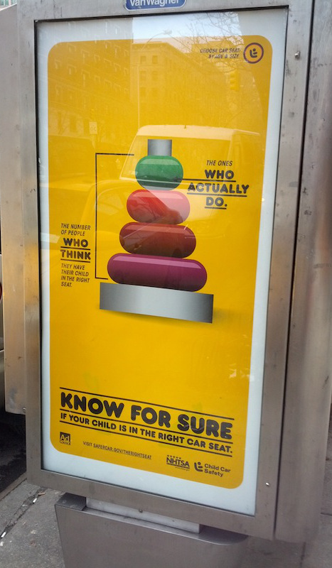
The message of the campaign is important, it goes without saying. And given that I’m talking about it,2 the campaign is probably being effective in communicating what it intends to: way too few kids are in the correct car seat.
However, there are some obvious problems with it as a piece of data visualisation. The poster I saw is part of a set of five, each with the same message, but with a different child-related item used to display the statistic:
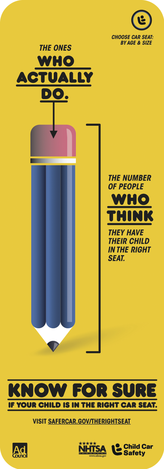
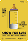


So what is the number of incorrectly-attached kids? According to the Fact sheet, “3 out of 4 kids are not as secure in the car as they should be because their car seats are not being used correctly.” Unfortunately, no source is listed for that claim, so let’s say that the number is 75%.3 How well do these posters convey that number? This table shows the proportion secure as displayed in each poster:
| Length | Area | |
| Pencil | 0.136 | 0.183 |
| Stack | 0.25 | 0.172 |
| Sneaker | 0.3 | 0.0797 |
| Popsicle | 0.131 | 0.169 |
| Bottle | 0.260 | 0.260 |
The scales drawn on the posters suggest that the length of the various elements is supposed to represent the statistic. This is moderately dubious, especially in the case of the of the ‘Sneaker’ diagram, so you might think that the proportion is measured by the area indicated instead. Depending on which poster you read, the proportion of kids who are properly attached (25%) looks to be somewhere between the problematic 30% and the scandalous 8%.
There are other problems too with these posters as data visualisations. For example, the bottom four rings on the ‘stacking toy’ poster collectively represent the 75% of incorrect seats. But they are of different colours and sizes, suggesting that there are four pieces of information being displayed, not just one. But here, it’s a distinction without difference.
The data visualition versus infographic distinction is a contested issue, but somewhere in there is the following question: is it that the numbers are used to convey the message, or instead that they are the message? Would a more accurate or consistent visualisation be better at conveying the message? Maybe not.
-
Full disclosure: I’ve had a Speck case on my MacBook Air since the day I bought it, and it’s brilliant. ↩
-
I am probably not the target audience, given that I have neither kids nor, indeed, a car. ↩
-
There is a prior problem which I’m glossing over here. The 75% number is the proportion of all kids who are not properly secured, whereas the claim in the adverts is the proportion of properly secured kids of those people who think their child is properly secured. There are almost certainly parents who do not think their kids are properly secured when they in fact are, but this is understandably a less pressing problem. However, it could be that all the children who are not properly attached have parents who know this already, in which case this sort of media intervention is not likely to be effective. I concede that this problem is probably just philosophical and not relevant to this particular case. ↩